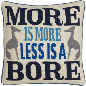
More is more, less is a bore. – Robert Venturi
For all of the maximalists out there, High Point Fall Market was heaven! Bold, colorful, attention grabbing pieces took center stage signaling a lovely return for a more optimistic outlook for the future of design.
Having pulled out of the great recession, consumers seem to be enjoying a return to “more is more” and “big is better”. Almost a celebration, it is perhaps the desire to distance ourselves from the last ten years of financial woes. We are seeing displays of maximalism everywhere—jewelry, watches, fashion. Even homes are returning to their larger proportions with square footage trends back to all time highs. Such displays of wealth are making a comeback, and this fall Century pays homage to this moment with a lobby full of bold patterns, rich textures and jewel tone finishes. Indeed a sensory playground, it is amazing how much punch can be packed into one room!-Century Furniture
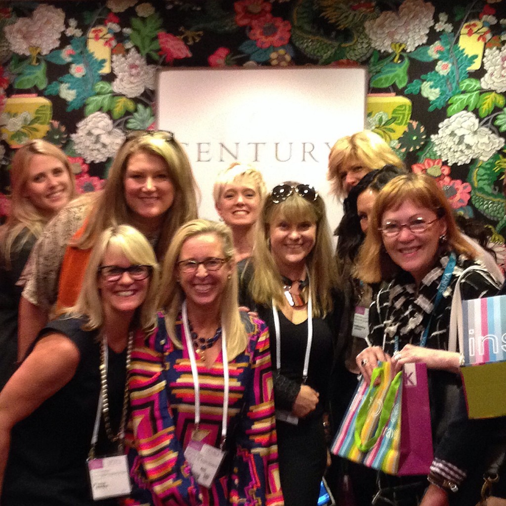
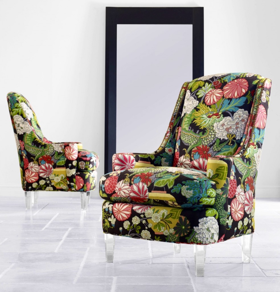
Century Furniture set the tone with their private elevator upholstered in Schumacher’s bold Chiang Mai print. Their showroom sparkled with a mixture of glamorous finishes such as brass, lacquered surfaces and lucite. Updating a traditional form with a modern flair, their high-backed chair (also upholstered in Chiang Mai) on lucite legs was the first piece seen in the entry continuing the theme from the elevator.
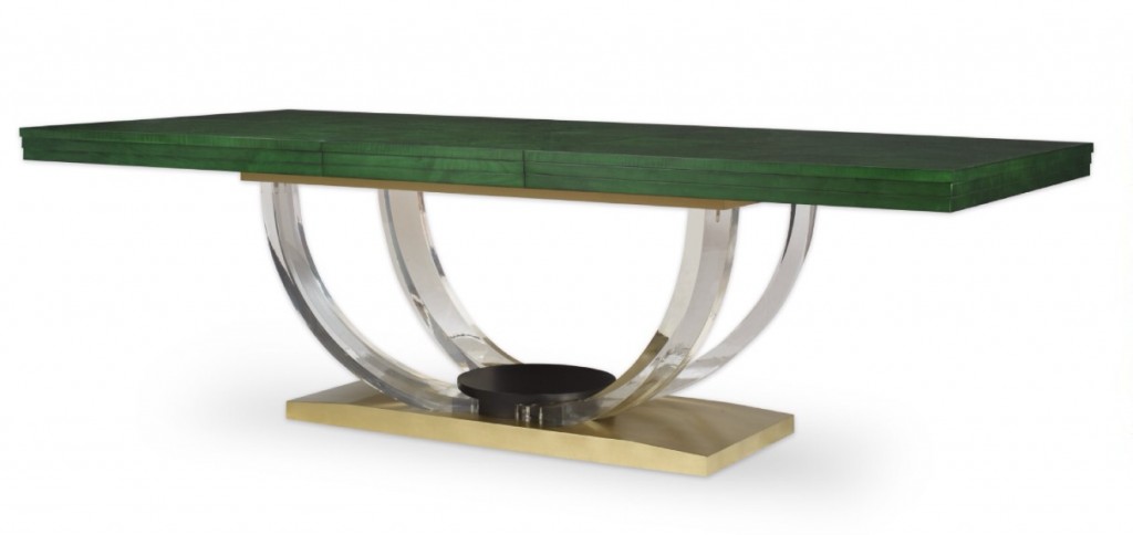
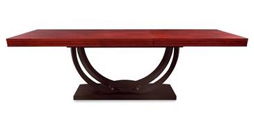 A stunning dining with a malachite top and lucite and brass base takes on many different personalities with customization options. It is equally as stunning in an oxbood red top with a black lacquer base.
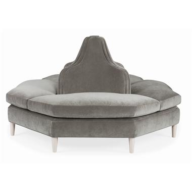 Design icon Windsor Smith designed this beautiful tete-a-tete which is almost 6 feet in diameter. It is a perfect sculptural object for any room or grand hall. Here it is shown in a subdued grey with cream legs but can be customized in any finish or fabric for maximum impact.
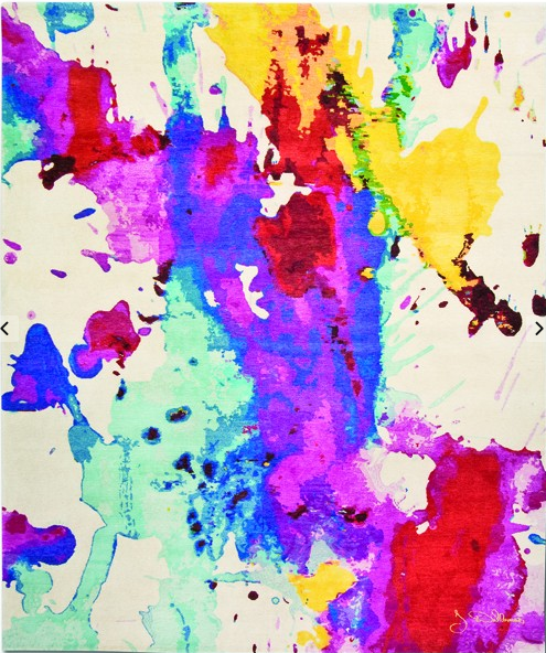
Rugs are often thought of as art for the floor. This silk /wool abstract rug from Marc Phillips certainly makes a statement. The collection is a tribute to action painting and characterized by being both naughty and smart, the same combination the artist Jurgen Dahlmanns likes in people.
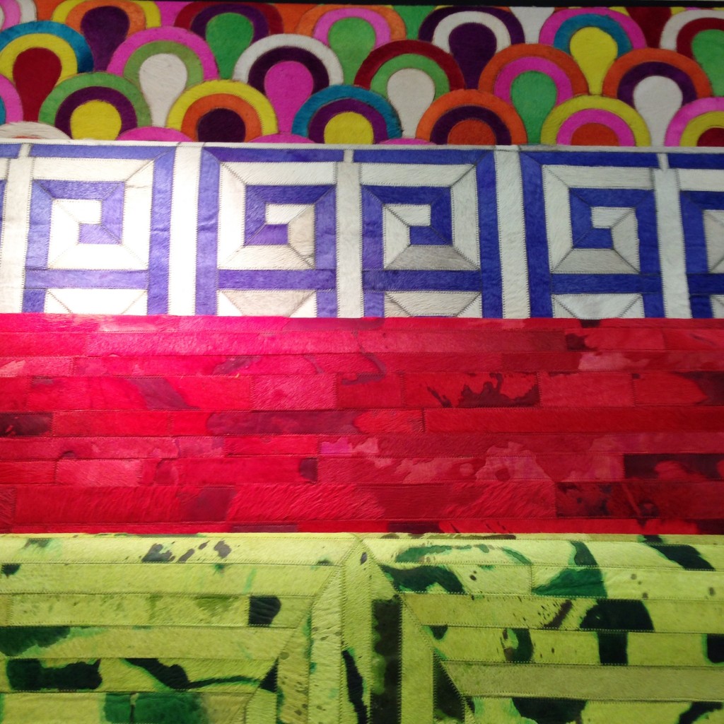
I have used this image in a previous post, but these colorful patchwork hide rugs from Madisons were absolutely DIVINE and I cannot wait to use them in a future project.
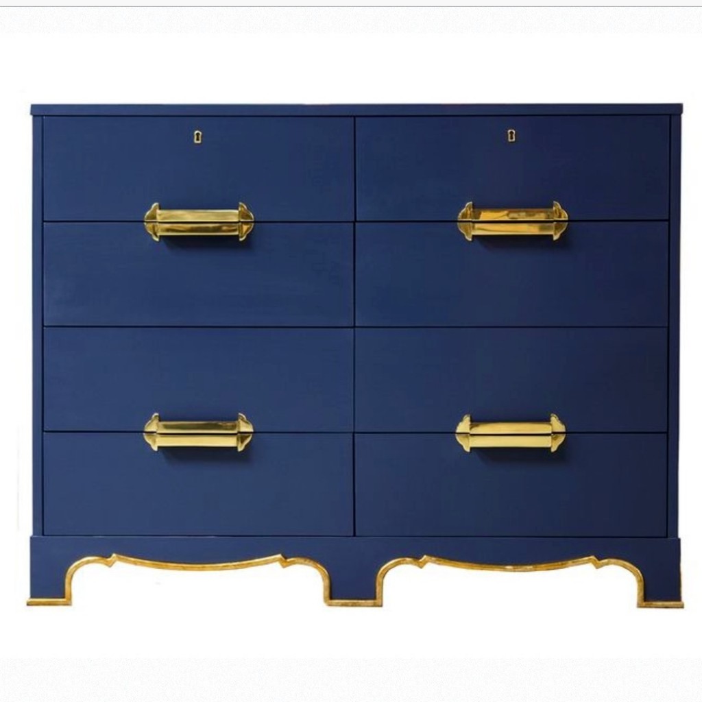 Kindel’s brilliant blue lacquered Westbury dressing chest is from the Dorothy Draper Collection. Originally designed by the design icon in 1939, it still feels chic and modern today. The chest is punctuated with beautiful brass detailing highlighting the curves of the legs and hardware.
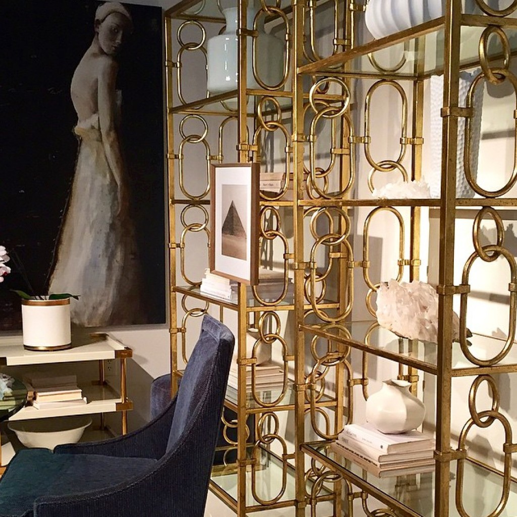
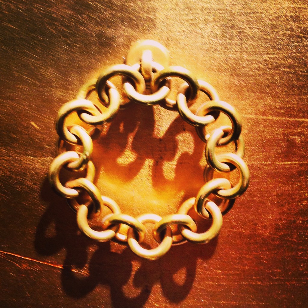
Brass continued to be a dominant trend in many collections. Bernhardt employed jewelry like detailing in several pieces from this bookcase to cabinetry hardware.
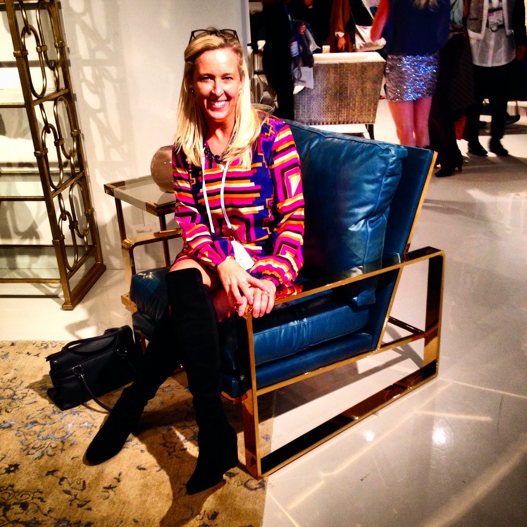
The cerulean blue leather and brass chairs had a 70s/ Halston-esque vibe that is both dazzling and sophisticated.
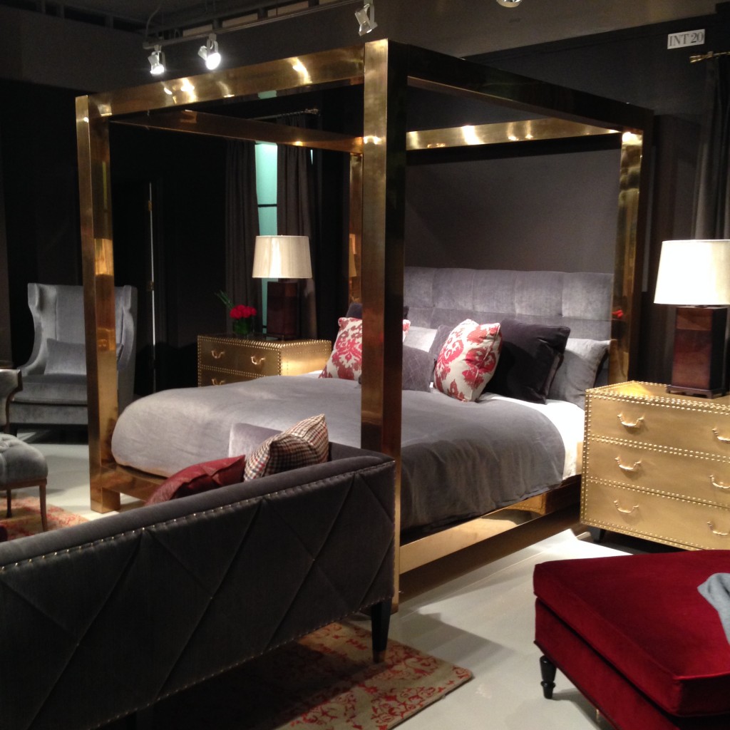
Introduced at last market, the bold brass bed only comes in a king so the scale and proportion of the bed are spot on.
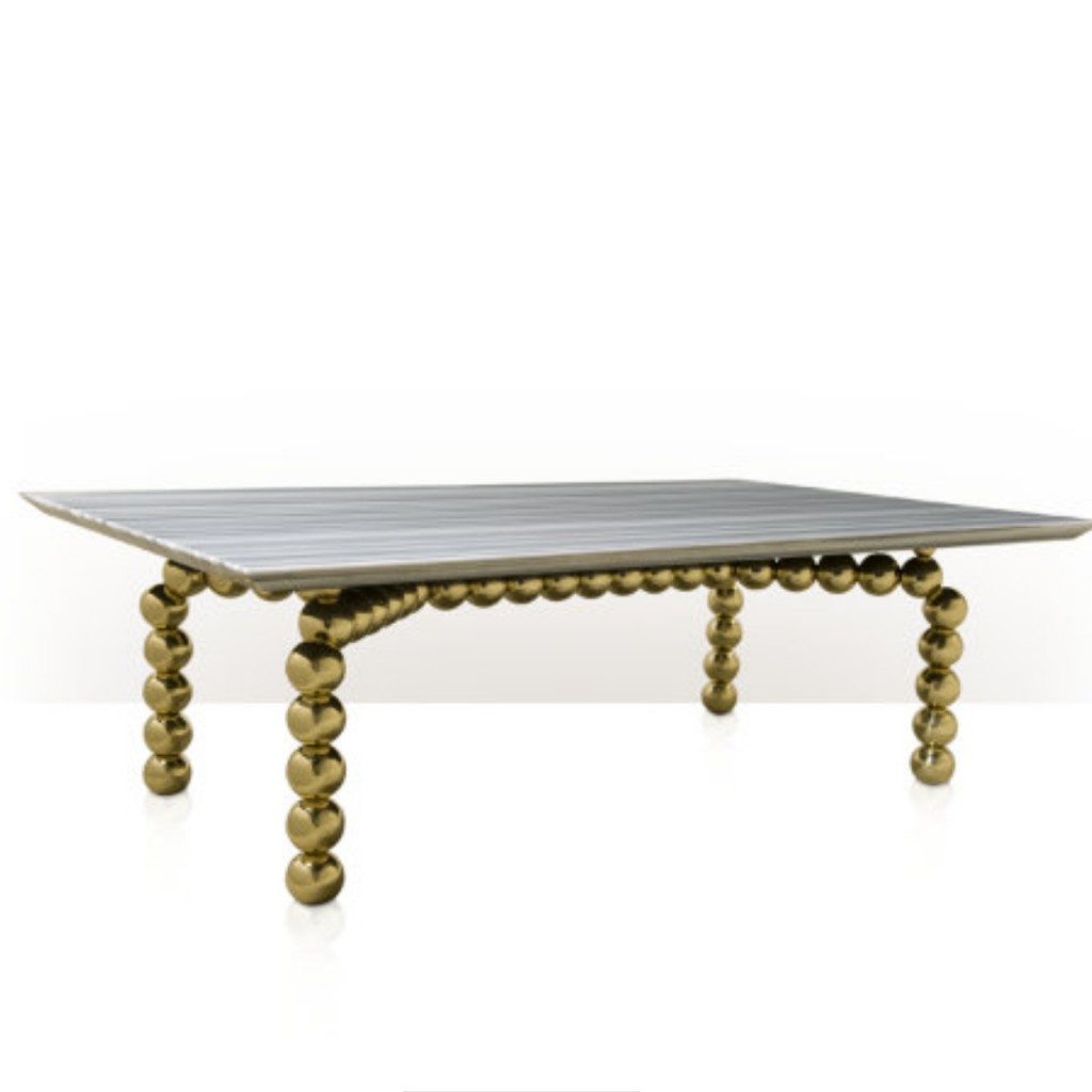 In another brilliant designer/ manufacturer collaboration, Jamie Drake created gorgeous pieces for Theodore Alexander that reflect his eye for unique and exuberant detail. His eclectic juxtaposition of materials is seen in this cocktail table composed of lustrous brass orbs and a gorgeous veined stone top.
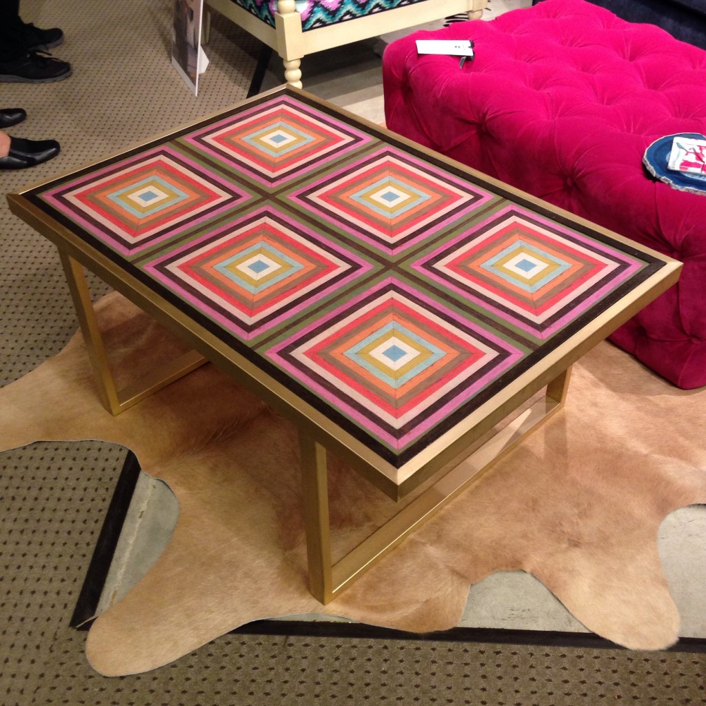
The Petite Kelly Brass Cocktail Table from Taylor Burke Home looked like an Op Art painting with its Mirth Studio tiles used as the top. The London Tufted Ottoman in hot pink velvet in the background is equally as bold.
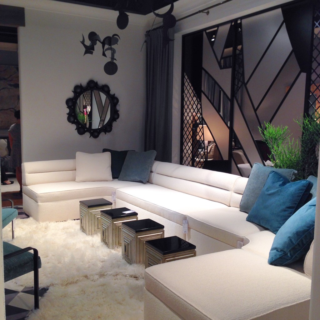
Laura Kirar’s new collection for Baker Furniture was inspired by her travels as well as her evolving art and design. She is known as a designer with the soul of an artist. The modern channel low backed Helena sectional blends beautifully with a grouping of her Jade Accent Tables.
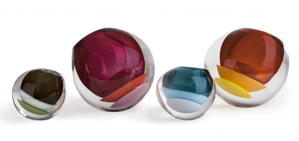
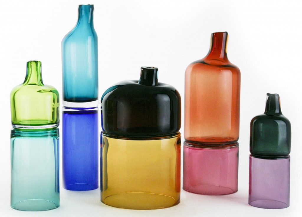
Even the accessories took on a more is more flavor. Sklo Studio debuted their join and mantle vessels. The join vessels are composed of two separate cylinders fused together while hot. The color combinations are complimentary and the palette bright. The mantle vessels are organic spherical shapes with overlapping triple color schemes of two opaque colors cupping a third transparent color void. They are then given a thick outer layer of clear crystal making them appear to float.
Please contact the design studio if you are interested in design services or any of the works seen here.
For more of my design inspiration, please follow along on Instagram, Pinterest, Facebook, Twitter and subscribe to Bespoke Banter….Thanks for reading!

