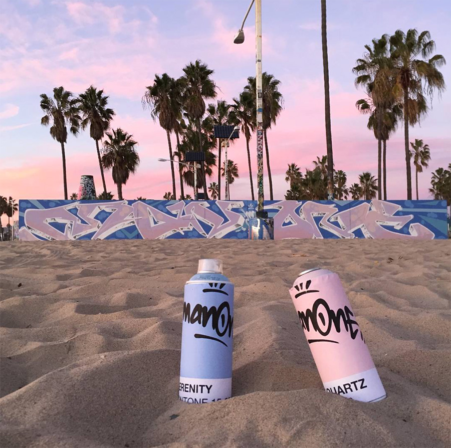
I was over the moon to hear that PANTONE had selected not one, but two of my favorite colors to be the 2016 Colors of the Year: a soft pink and an blue known as “Rose Quartz” and “Serenity.” This is the first time PANTONE has selected two colors to represent the Color of the Year.
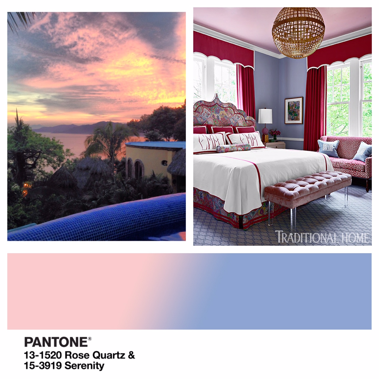
Leatrice Eiseman, Executive Director of the PANTONE Color Institute, elaborates, “Rose Quartz is a persuasive yet gentle tone that conveys compassion and a sense of composure. Serenity is weightless and airy, like the expanse of the blue sky above us, bringing feelings of respite and relaxation even in turbulent times. As consumers seek mindfulness and well-being as an antidote to modern day stresses, welcoming colors that psychologically fulfill our yearning for reassurance and security are becoming more prominent. Joined together, Rose Quartz and Serenity demonstrate an inherent balance between a warmer embracing rose tone and the cooler tranquil blue, reflecting connection and wellness as well as a soothing sense of order and peace.”
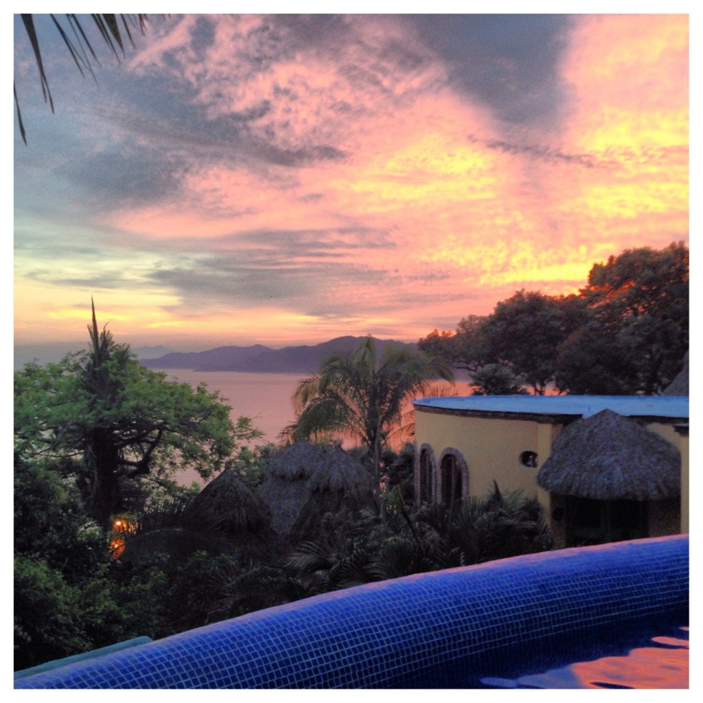
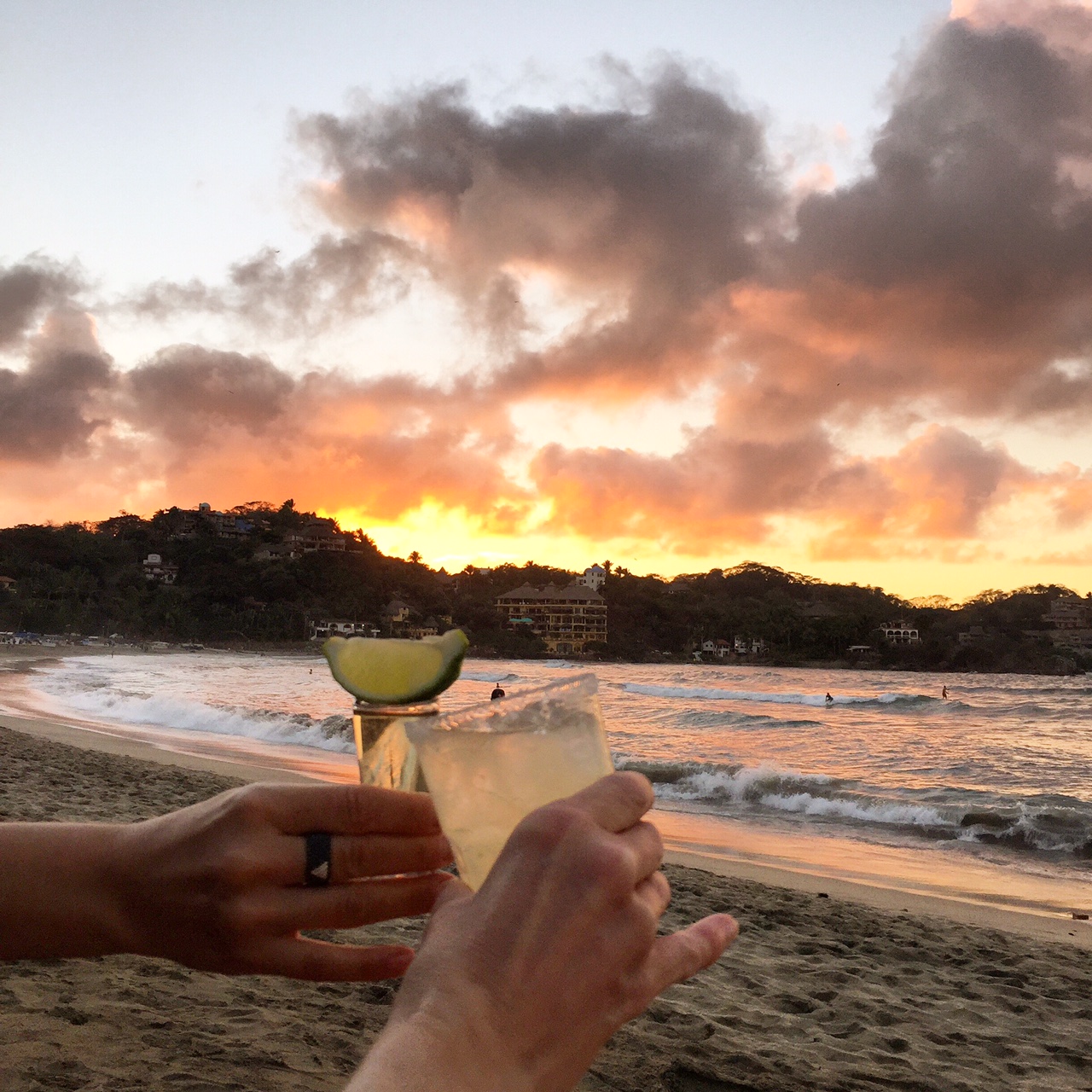
I am constantly looking at my photographs for design inspiration. Sometimes I am aware of what is inspiring me and other times, it is not until after I have completed an interior that I realize the source. It was not until a favorite design blogger Carmen Natschke of The Decorating Diva brought up the connection to PANTONE’s “Color of the Year, that I realized from where my inspiration originated. My “happy place” is Sayulita, a small surfing/fishing village on the Nayarit Riviera in Mexico. I have spent hours gazing at this horizon watching it transform into a myriad of pinks and blues from sunrise to sunset.
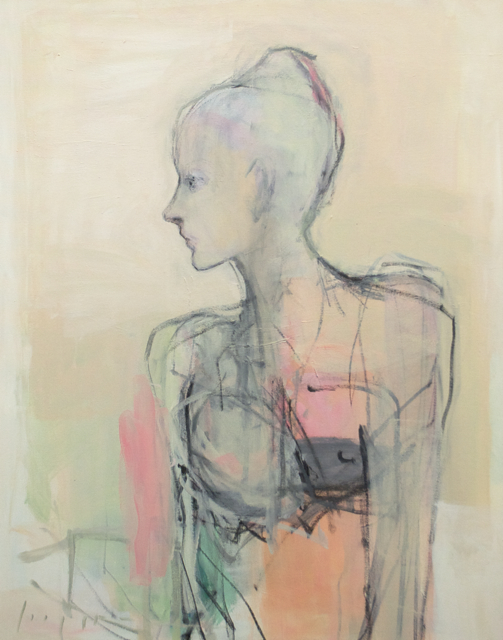
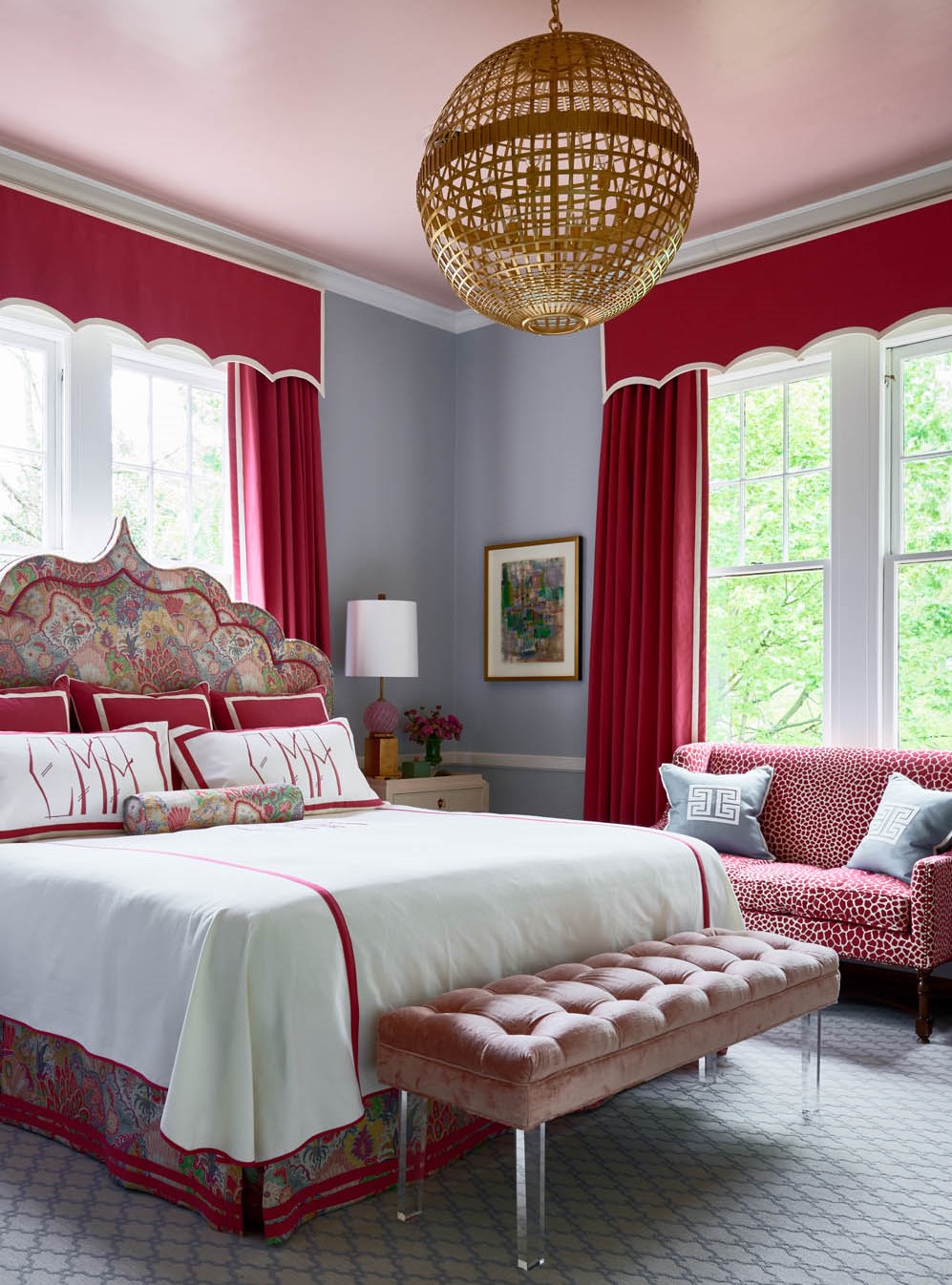
I am drawn to the same colors in art that I am in nature, which was the starting point for this bedroom I designed for the 2015 Traditional Home Junior League of High Point this past spring. It all began with a painting…
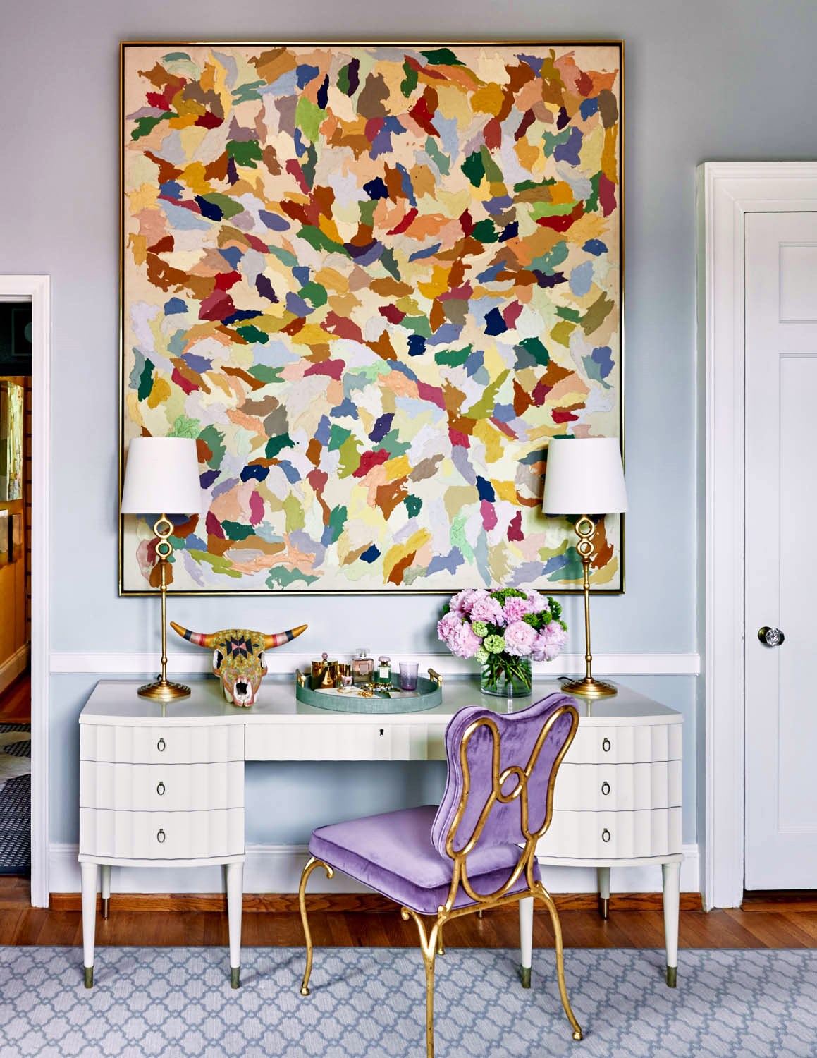
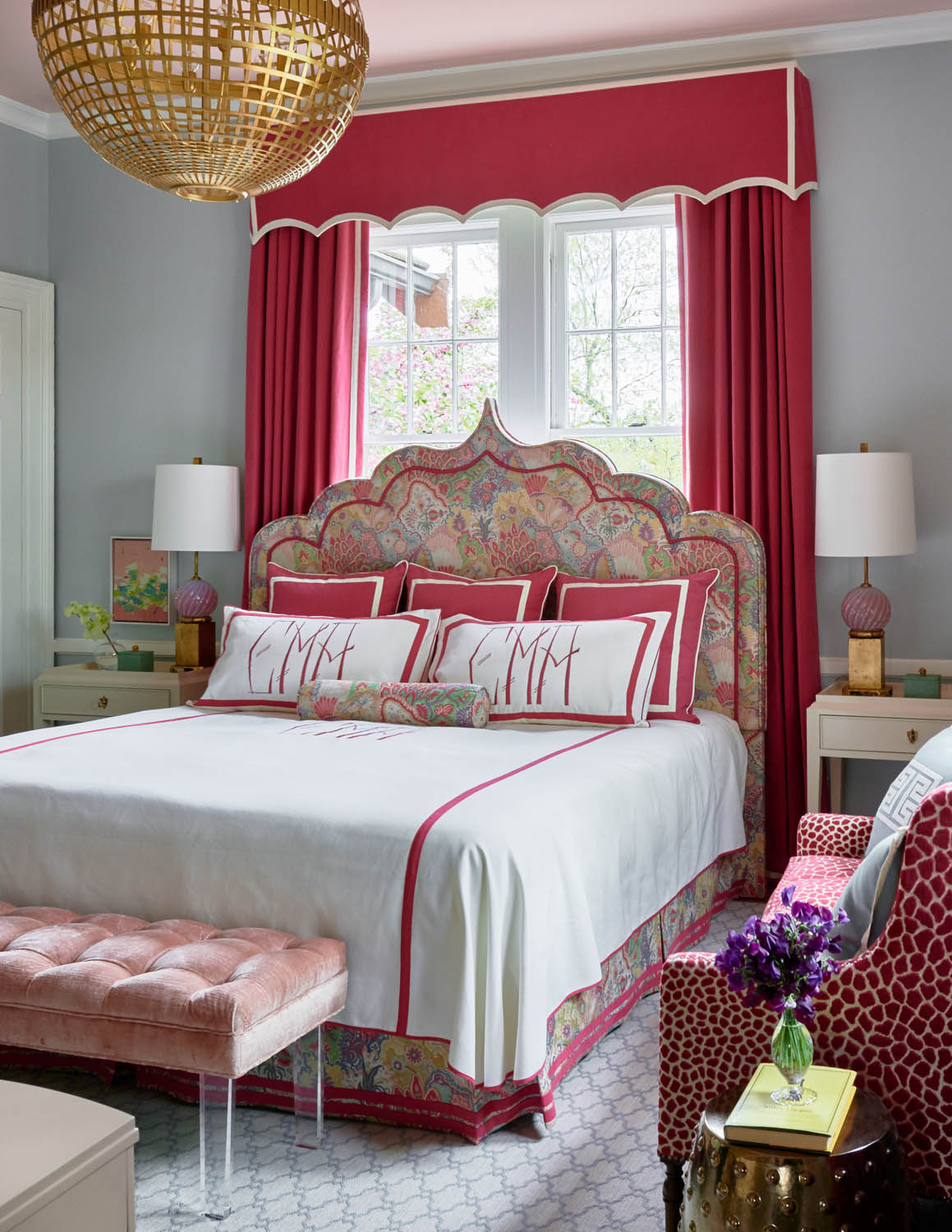
I envisioned my “imaginary” client as the sophisticated daughter of the family. She is well-travelled, artistic, and likes a modern, yet glamourous room that still reflects her Southern roots. A portrait by favorite artist, Kate Long Stevenson, (from Hidell Brooks Gallery) became my muse for the project. I had her in mind whenever I was making decisions for the space. The portrait and the large vintage abstract provided the color palette that inspired the design scheme. The room is a blend of unique pieces from High Point based craftsmen along with a collection from her travels around the world. A Moroccan inspired headboard, Murano glass lamps, original modern art, bespoke linens, dressmaker detailed drapery, and glamorous materials such as shagreen, agate, brass, and velvet add to the feminine mystique of the space. I indulged myself with an “imaginary” trip around the world for inspiration for the space…from the palaces of Morocco and India to the Murano glass factories and sunsets on the Nayarit Riviera.
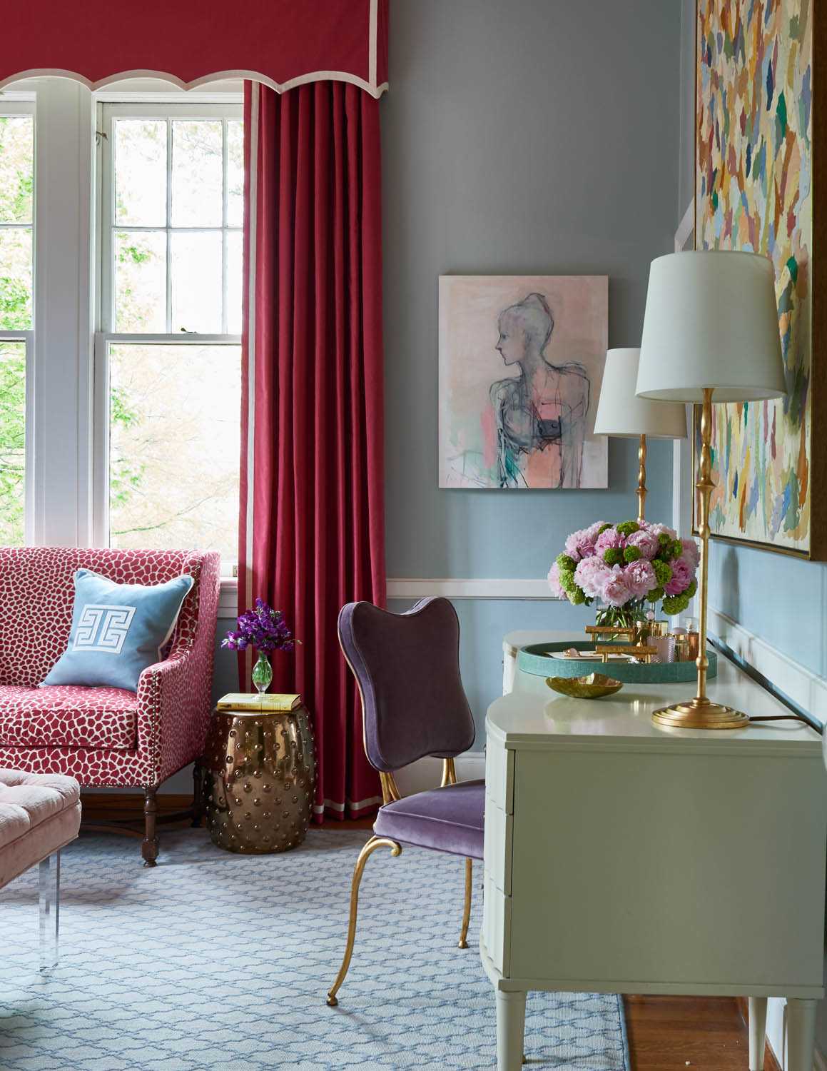
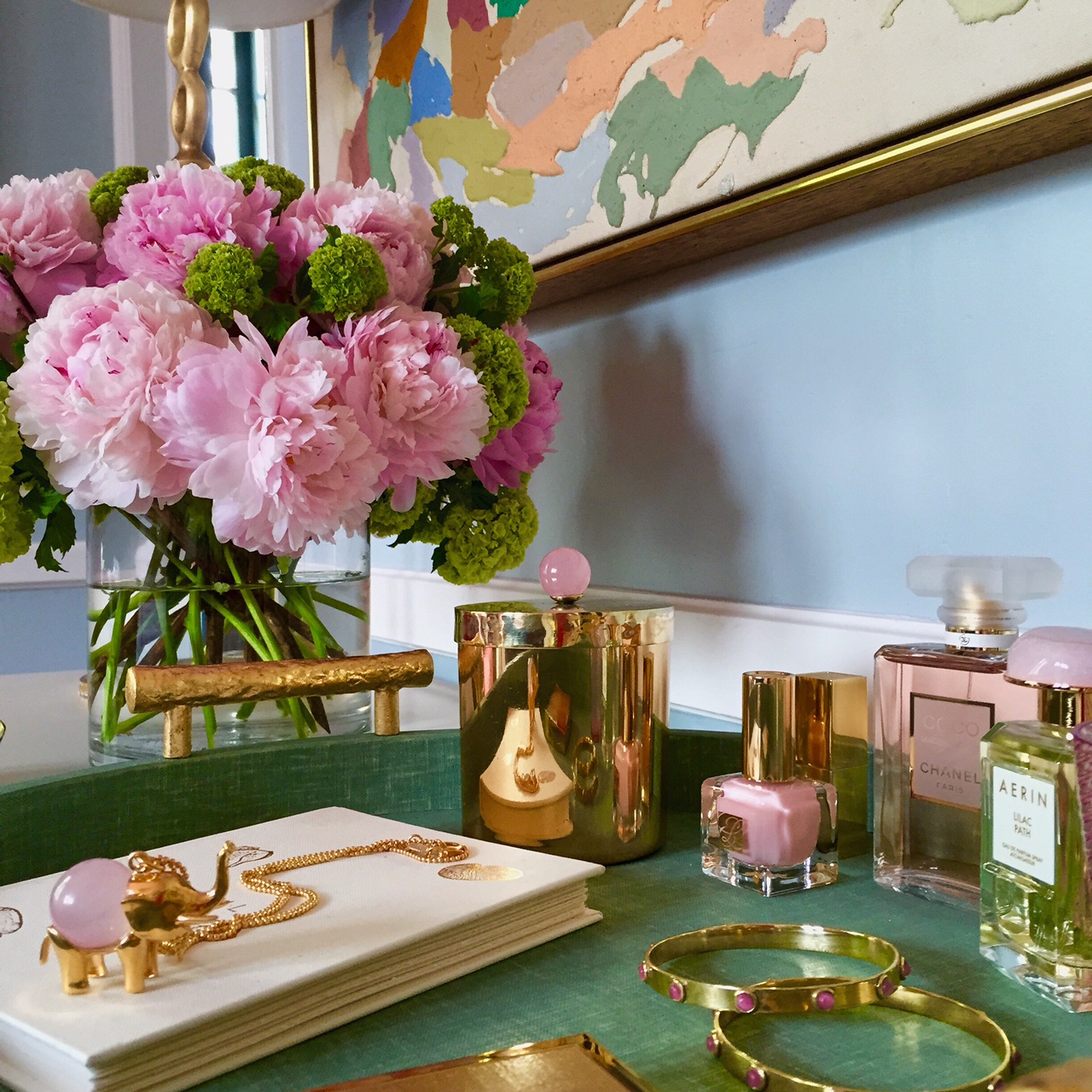
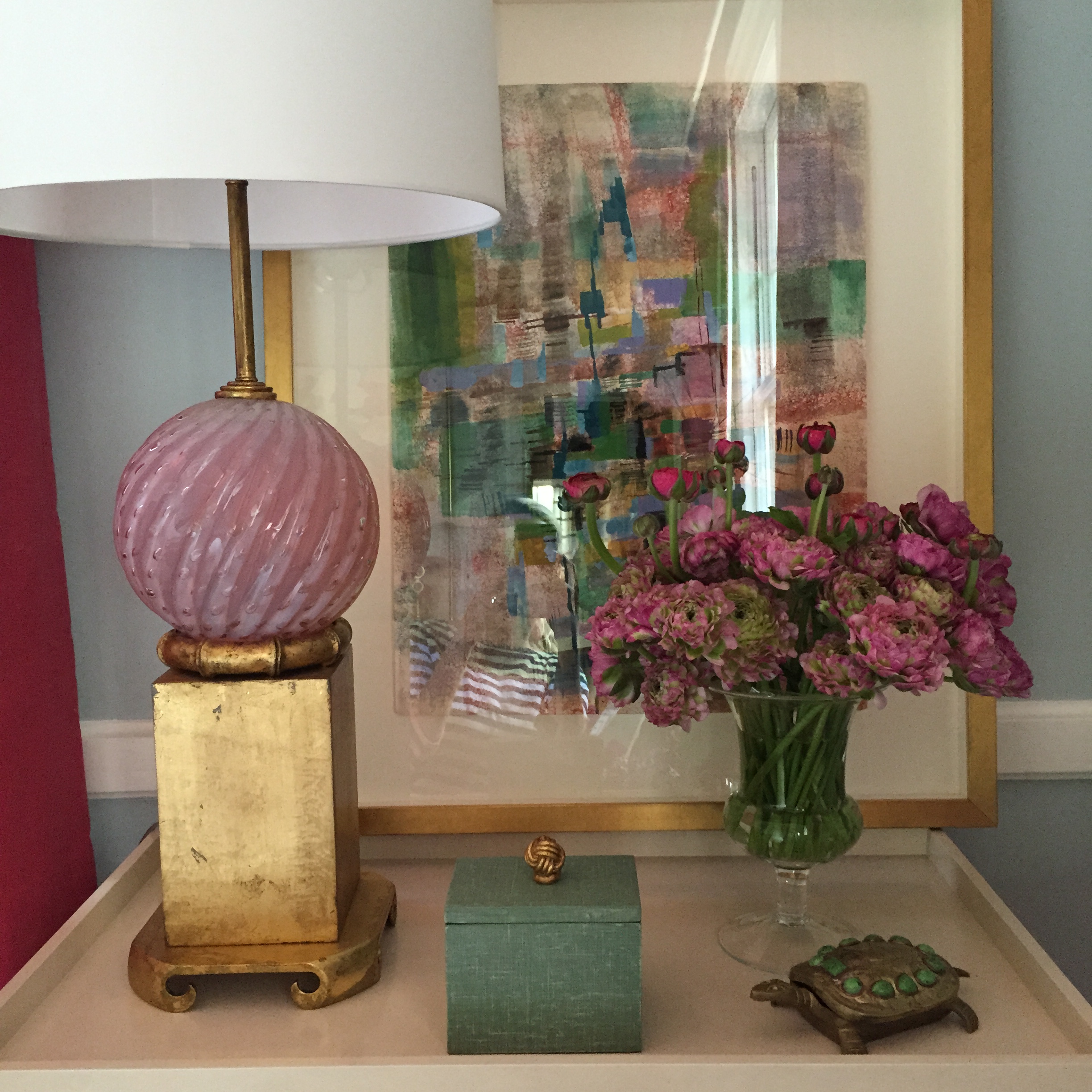
Pale blue walls and a high gloss pale pink ceiling evoke the Sayulita sky. The colors are repeated throughout the space in the fabrics, paintings, lamps, flowers, accessories, and finishes. The “Jaipur” print by Clarence House brings the palette together on the headboard and dust ruffle adorned with bespoke Leontine Linens. A Brunschwig & Fils linen velvet reflects the Rose Quartz on the ceiling. Pink Murano glass lamps by Louis Gaskill and accessories by Addison Weeks continue the theme. Cream and gilt furnishings by Bernhardt provide a neutral backdrop.
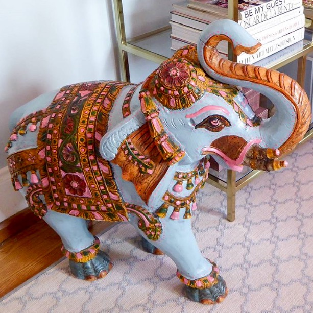
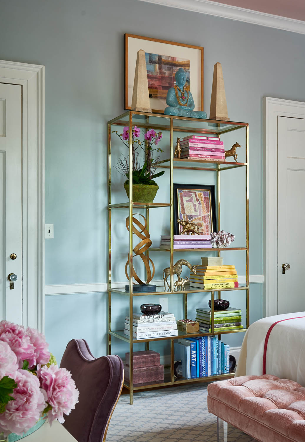
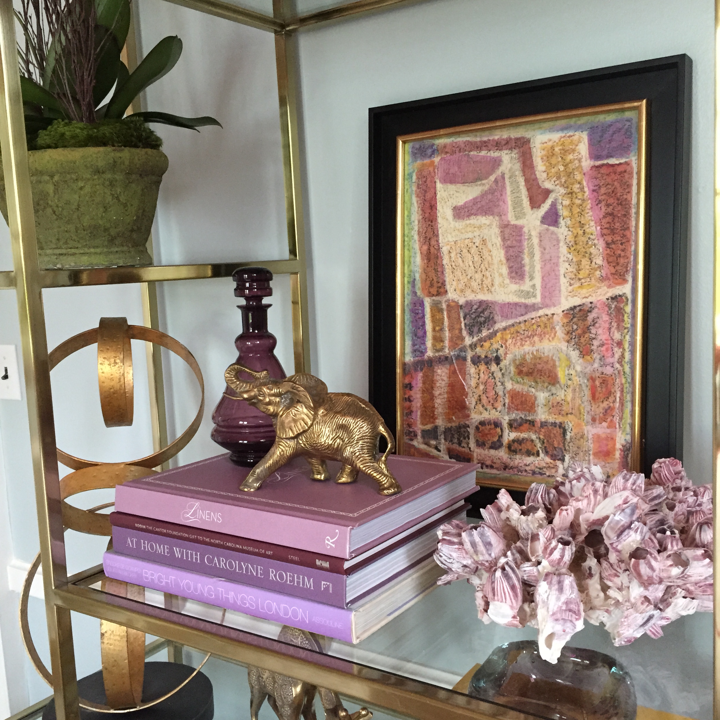
Vintage watercolors from Gillian Bryce at 214 Modern Vintage and an over scaled 1970s abstract from Darnell & Company add dimension and layers to the space. A deeper shade of pink pulled from the fabrics and the art is used at the window and on the antique settee. Brass light fixtures by Aerin Lauder for Circa Lighting highlight the space. A gilded iron chair by Celerie Kemble for Henredon is dressed in a deep lavender velvet from Kravet. Accessories from Made Goods in lavender snakeskin and jade linen add an exotic touch to the space while an Indonesian elephant looks right at home in her painted glory.
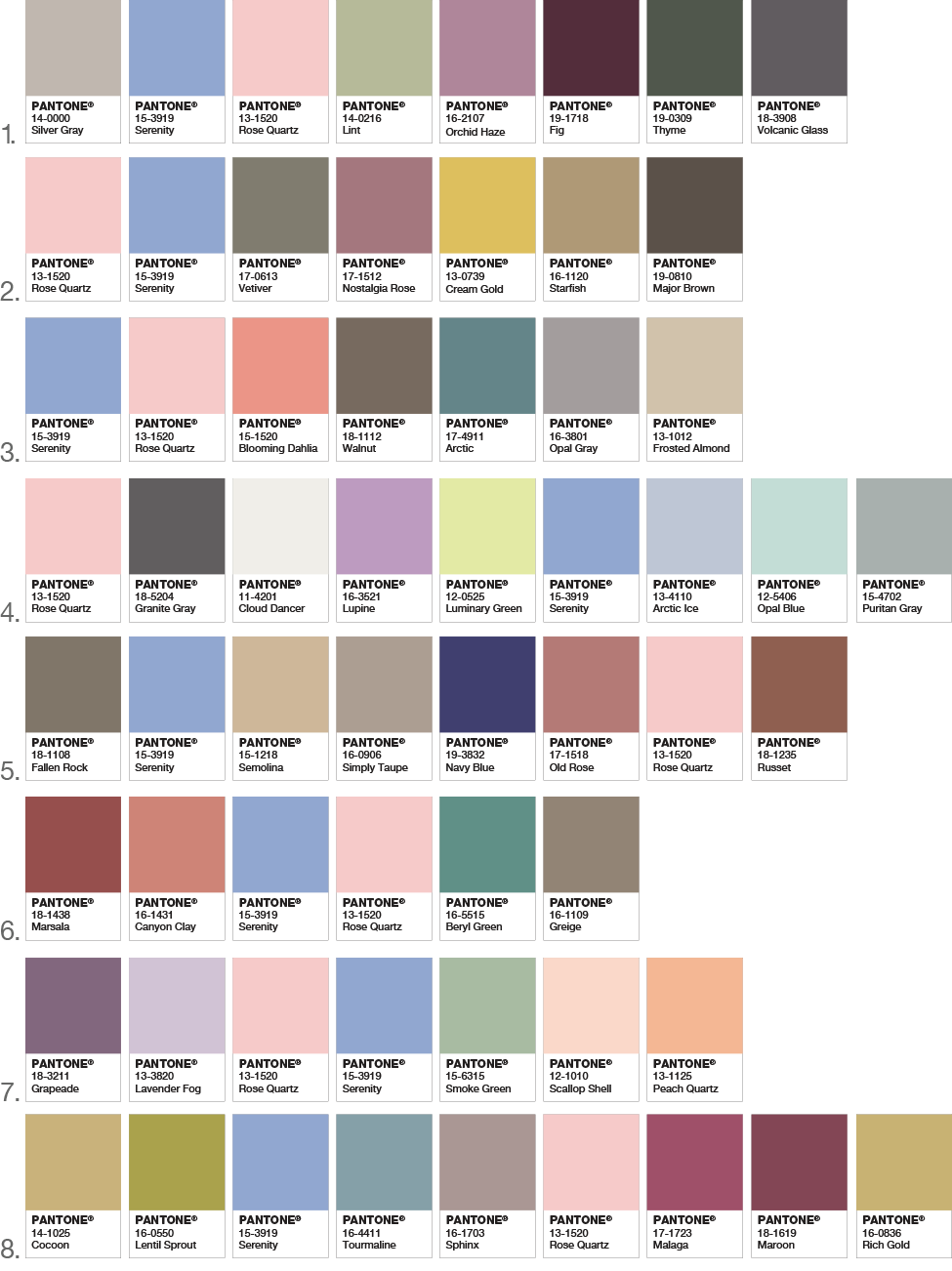
ROSE QUARTZ AND SERENITY PAIRINGS:
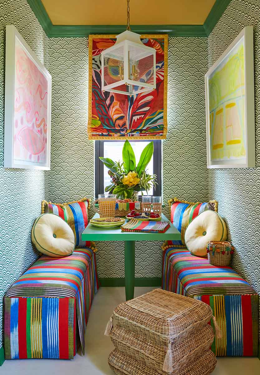
Whether in soft or hard surface material, the pairing of Rose Quartz and Serenity brings calm and relaxation. Appealing in all finishes, matte, metallic and glossy, the engaging combo joins easily with other mid-tones including greens and purples, rich browns, and all shades of yellow and pink. Add in silver or hot brights for more splash and sparkle
For more design inspiration, please follow along on Instagram, Pinterest, Facebook, Twitter and subscribe to Bespoke Banter. Thanks for reading!