“To search for the old is to find the new.” -Confucius
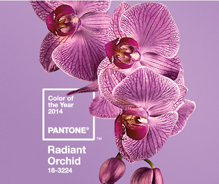
There has been a tremendous amount of press over Pantone’s Color of the Year “Radiant Orchid,” but what about all of the other colors in the forecast? So much time and thought goes into predicting these palettes season to season. When I was in design school, we visited a color forecasting company in Manhattan. I was so intrigued by the process the experts use to come up with what will be the next “IT” colors.
For the International Color Authority based in London, color forecasts are decided 24 months in advance by expert colorists who meet twice yearly in specialized panels. The group is made up of professionals from international textile and paint companies along with several independent color analysts. Their names are never disclosed. Every fashion, fabric, product, furnishings, paint manufacturer in the world subscribes to these color forecasts in order to plan their future business.
Color is the SINGLE most important factor at the point of sale, and comes before even the style or the price point. So, how do the experts predict what these colors will be? They analyze just about everything from political and environmental events to pop culture, museum exhibitions and historical trends.
“Professionals who work with color are constantly sourcing art and artifacts for ideas. Museum exhibitions are having, at least since the first drawings of Pompeii were exhibited in the eighteenth century, an inordinate influence on fashion and design. In fact, palettes have routinely travelled around the world, through trade in artifacts, through conquest and looting of art, or through tourism. It is revealing to see what the DeStijl artists borrowed from medeval stained glass, how William Morris was influenced by Gothic tapestries, how a palette that originated in ancient Egypt ended up in Dutch majolica in the eighteenth century, and how each step of the way color combinations are given a slightly different spin. Indeed, only by seeing how color was used in the past is it possible to find fresh new ways to use color in the present.” -Margaret Walch and Augustine Hope, Living Colors
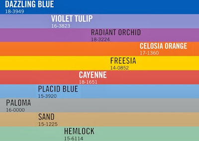
Below is the Spring Color Forecast from Pantone….
And their “IT” color for 2014…
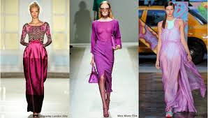
It is striking to see the similarity of the above colors in contrast to the historical palettes used in the paintings, fabrics and fashions below…
 |
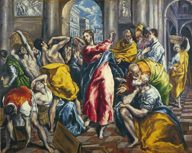
| El Greco, Purification of the Temple, circa 1600 |
 |
| El Greco Palette |
A true modernist during his time, El Greco(1541-1614) used color boldly to tell the story he would paint. This work was a complete contrast to the work of Leonardo da Vinci. The acid yellows, chartreuse, and intense blues symbolize the intensity Christ had used to drive the merchants from the sanctuary depicted here. Even the purplish red used for Christ’s robe was a hallmark of El Greco (a madder lake tinted with ultramarine blue.)
 |
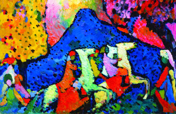
| Wassily Kandinsky, Blue Mountain, circa 1908 |
 |
| Kandinsky Palette |
Wassily Kandinsky (1866-1944) was known as “the godfather of abstract art.” He felt colors should be used in art purely for their emotional and symbolic content and not for what they represent. Blue was the most significant and spiritual color for Kandinsky which was also a favorite of stained glass artists and icon painters. His palette above is in direct contrast to the Cubists who were also working at the same time. They felt color subverted their subject matter whereas Kandinsky celebrated color’s emotional qualities.
 |
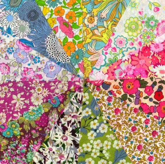
| Liberty of London Prints, circa 1940s |
 |
| Liberty of London Palette |
Founded in 1875, Liberty of London became a major influencer of fashion by creating fabrics in the colors found in Far Eastern art and textiles. Arthur Lasenby Liberty introduced oriental exotica to the British middle class. As popularity grew, Liberty decided to manufacture these textiles locally. In the 1920s, the fabric’s color palette shifted from dusky color to clearer colors. The more feminine palette made the fabrics perfect for fashion. Liberty’s printed florals are still widely used today.
 |
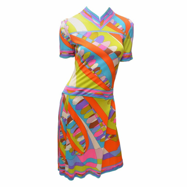
| Emilio Pucci, circa 1960 |
 |
| Emilio Pucci Palette |
Emilo Pucci (1914-1992) psychedelic prints revolutionized women’s fashions during the 1950s and 1960s. His signature colors…magenta, lavender, Pucci blue, deep golden yellow, acid green, and flamingo pink were all inspired by his travels to the Mediterranean coast and Tuscan landscape. He would dive with camera in hand to capture the colors of the coral, fish and seashells. He was also influenced by the artists of his time. He would swirl colors together to achieve the same explosive energy found in a Lichtenstein or Warhol canvas.
To read more about color palettes throughout art history, click here to order Living Color by Margaret Walch and Augustine Hope.
