I am still overwhelmed with inspiration and information from my recent trip to New York. The Kips Bay Showhouse was the perfect way to kick off Blogfest 2012. It was such a pleasant surprise to meet several of the designers that created the spectacular settings at the Aldyn. They were all extremely approachable, friendly and willing to share their inspiration behind their interiors. Here are a few favorites…
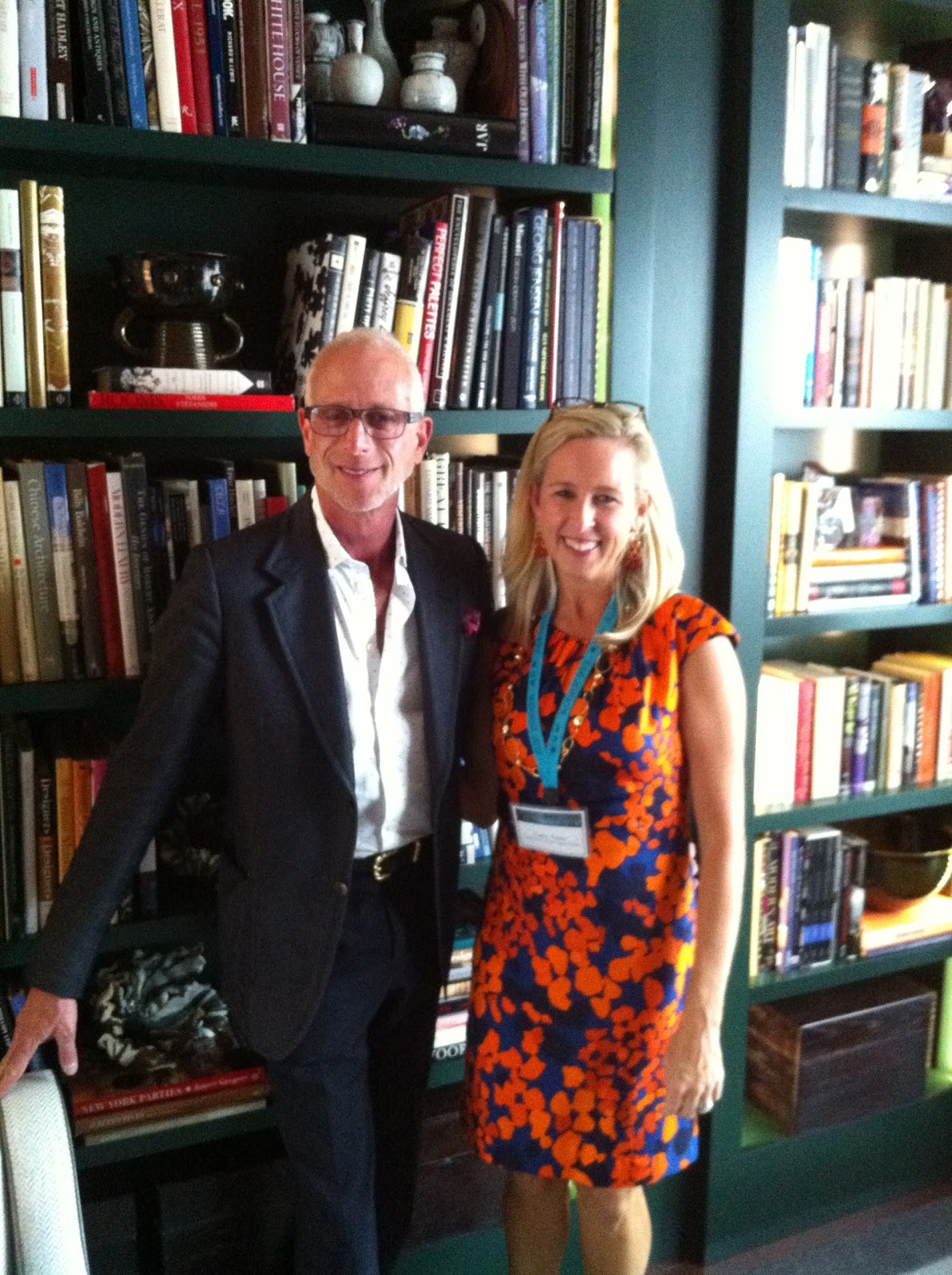 |
| Jamie Drake and Admirer (Moi!) |
 |
| Photo courtesy of the New York Times |
The “Library” was designed by Jamie Drake. There were so many incredible decorative details in this room. The ceiling was covered in a hammered silver wallpaper. One side of the room was anchored by deep emerald painted bookcases and the other included a seating area with the focal point of the painting, “Winter Gate,” by Andy Harper from Danese. Mr. Drake pulled the colors out of the painting to uses an accents around the room repeated in the sofa pillows, books and flowers. A collection of sleek art deco side tables, a contemporary cocktail table, 1930s ceramics and a mid century desk made by Jules Wabbes completed the room.
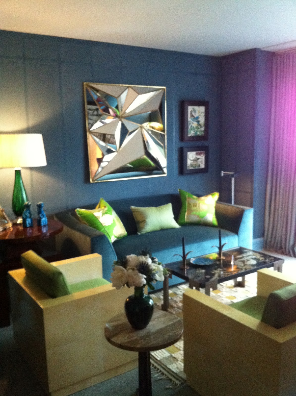
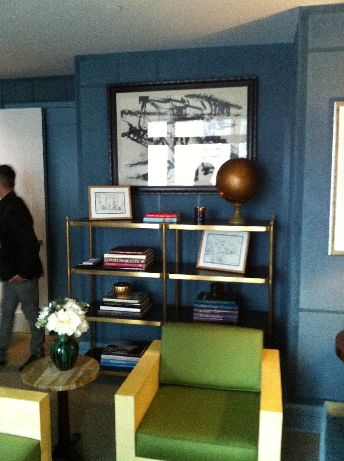
Brian del Toro’s “Study” was magnificent. At first glance, the walls appeared to be covered in peacock blue wallpaper, but were actually a custom painted finish using 2 shades of paint in two different sheens to achieve the panelled effect. The shamrock green upholstery fabric from Schumacher on the parchment deco chairs popped against the peacock blue background. The sculptural mirror above the sofa reflected light all around the room. The mixed media collages, black and white abstract and and deco furnishings were sophisticated, modern and timeless.
 |
| Photo courtesy of the New York Times |
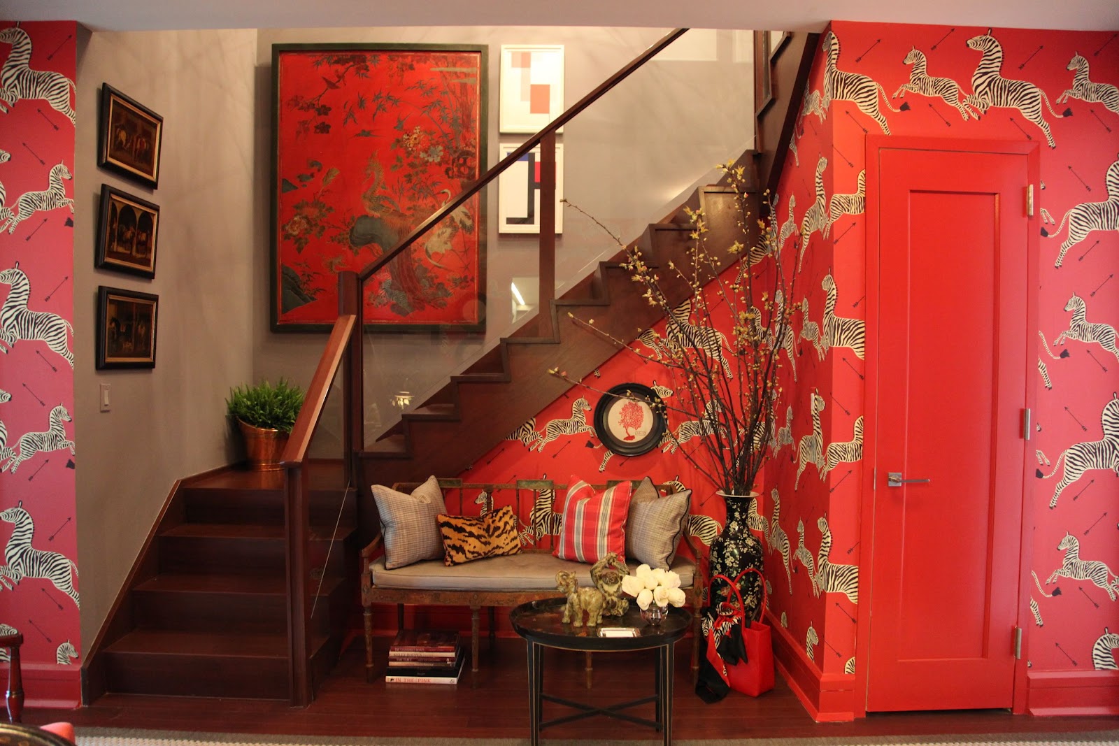
Bryant Keller set a dramatic tone with this wallpaper designed by Flora Scalamandre in the 1940s. In his New York times article, Guy Tribet explained the significance of selecting this particular wallaper,
“That the wallpaper was a visual trademark of the late lamented restaurant Gino’s is itself a knowing wink to the profession, since it was to Gino’s or else the Isle of Capri on the Upper East Side that decorators of yesteryear typically repaired after a grueling day gathering samples at the Decoration & Design Building on Third Avenue, slipping off their Belgian loafers under the table and fortifying themselves with strong drink.”
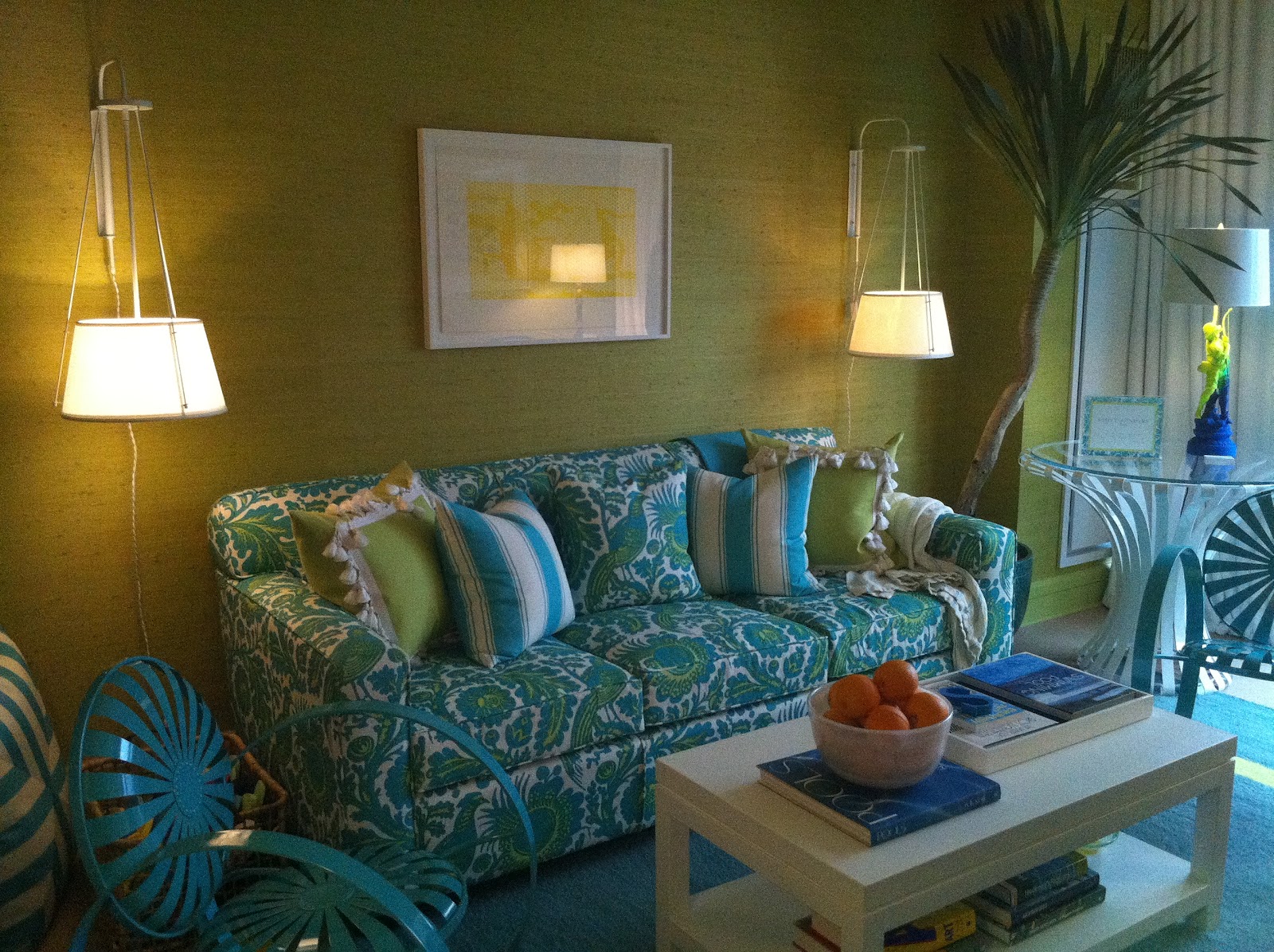
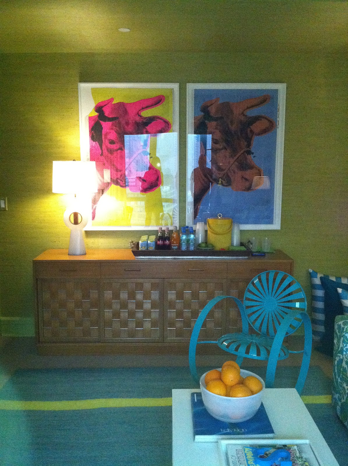
“The Cabana” by Scott Sanders was by far the most vibrant room in the showhouse. The split pea grass cloth by Phillip Jeffries was the perfect backdrop for the artwork and turquoise fabrics and finishes he used throughout the space. We visited the showhouse on such a dreary day and when you walked in this room, it made you feel like the sun was shining and lifted everyone’s spirits.
 |
| Holly Hollingsworth Phillips, Thom Filicia and Yours Truly |


Ever since Queer Eye for the Straight Guy, I have had a huge design crush on Thom Filicia. His “Gallery” for the showhouse must have been the most challenging room to design of all of them. It was situated right in the middle of the space with an opening on each of the four walls. There was very limited wall space to make an impact, yet he still managed to do so with the his creativity. The walls and ceiling were lacquered in emerald green (a recurring color in this year’s showhouse). The walls were so shiny that you could see your reflection. He treated each of the openings with portieres which added softness to the space and filled very vertical space with artwork. All fabrics and carpet were from his own collections for Kravet and Safavieh.
 |
| Photo courtesy of the New York Times |
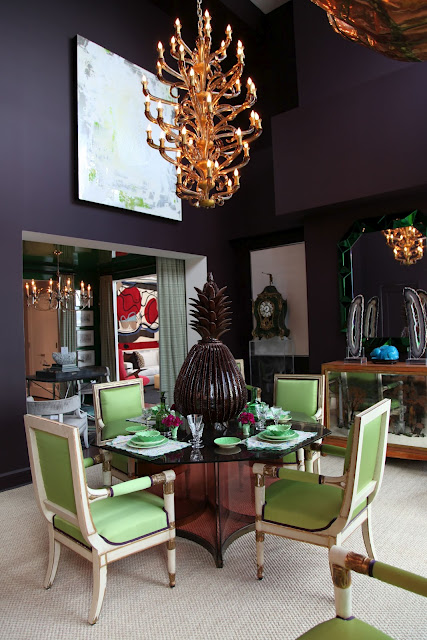
Adjacent to Thom’s gallery was the “Dining Room” by Todd Alexander Romano. This room was quite the showstopper. Its double height ceiling and lack of architectural detail must have been impossible to work with, yet Todd pulled it off beautifully. The aubergine walls are stunning and the apple green silk on the dining chairs visually connect to Thom’s gallery. The Murano glass chandlier was from the 1950s. The dining table was made of smoked glass and tied in with the aubergine walls.
Guy Tribet of the New York Times describes Mr. Romano’s space, “The narrative that suggested itself to Mr. Romano involved a gallery. He would treat the ungainly dining room as a space well suited to die-hard Manhattanites of a type that, as Marlene Dietrich once noted, tend to be hungry for everything except food.”
He would alter the proportions and the mood of the too-tall room by painting the walls a nocturnal hue, a color he called aubergine.
Aubergine, of course, is French for eggplant, and one of the enduringly charming traits of those in the decorating trade is that, being in the fancying-up business, they seldom prefer a dull English word when a swanky-sounding foreign one is ready at hand. (Take, for example, that Louis XV armchair — uh, fauteuil.)
Mr. Romano knew instantly, or semi-instantly, that he would cover the walls with big modern paintings by Rachel Hovnanian and Marc Van Cauwenbergh and hang a faceted poison-green 1960s Italian mirror, and that he would place in the middle of the neutralizing sisal rug an octagonal Alessandro Albrizzi table, with room to seat six to eight people, an ideal number for dinner because, he said, "Less is boring and with more you get no general conversation."
He would arrange around the table French Empire chairs because, he said, referring to himself in the third person in a way that somehow seems unstudied, "there will always be a French chair in a Todd Alexander Romano room."
He would borrow from Guy Regal at Newel Antiques an immense 42-arm 1940s Venetian chandelier, using it to anchor the space. He would add a pair of ivory “Bunny” porcelain lamps from Christopher Spitzmiller atop a white-painted, 19th-century English console table. For an added touch of whimsy, or possibly madness, he would mount a monumental brass giraffe bust by the Mexican sculptor Sergio Bustamante high on one wall.
He would accessorize the space with amethyst geode cathedrals and a bomb-sized hunk of terra cotta in the shape of a pineapple and, when he was finished with all that, the imaginary family Mr. Romano conjured up to inhabit the room might feel when dining as if they were appearing nightly in a remake of “Boom” and not merely sitting down to General Tso’s chicken eaten straight from the container.
THIS, perhaps, is the place for a reporter to declare himself. I love decorators. I love the idea of their odd, now struggling profession, with its famous lineages (Parish-Hadley, McMillen Inc., Colefax and Fowler) reminiscent of circus dynasties (think Flying Wallendas).
I admire their skills, their professional lore, their gifts as psychologists and mind-readers called on to enter strangers’ houses and help those strangers feel somehow more at home. It must take moxie to convince others you have better taste than they do, since taste, after all, is little more than habit and can be acquired.
There is something else. The decorators of this city, people tend to forget, keep thousands of local crafts and tradespeople employed, not the least of these the woman who lives in Far Rockaway and makes by hand the paper lampshades Mr. Romano places in the houses of clients around the world.”
  |
| Photo courtesy of the New York Times |
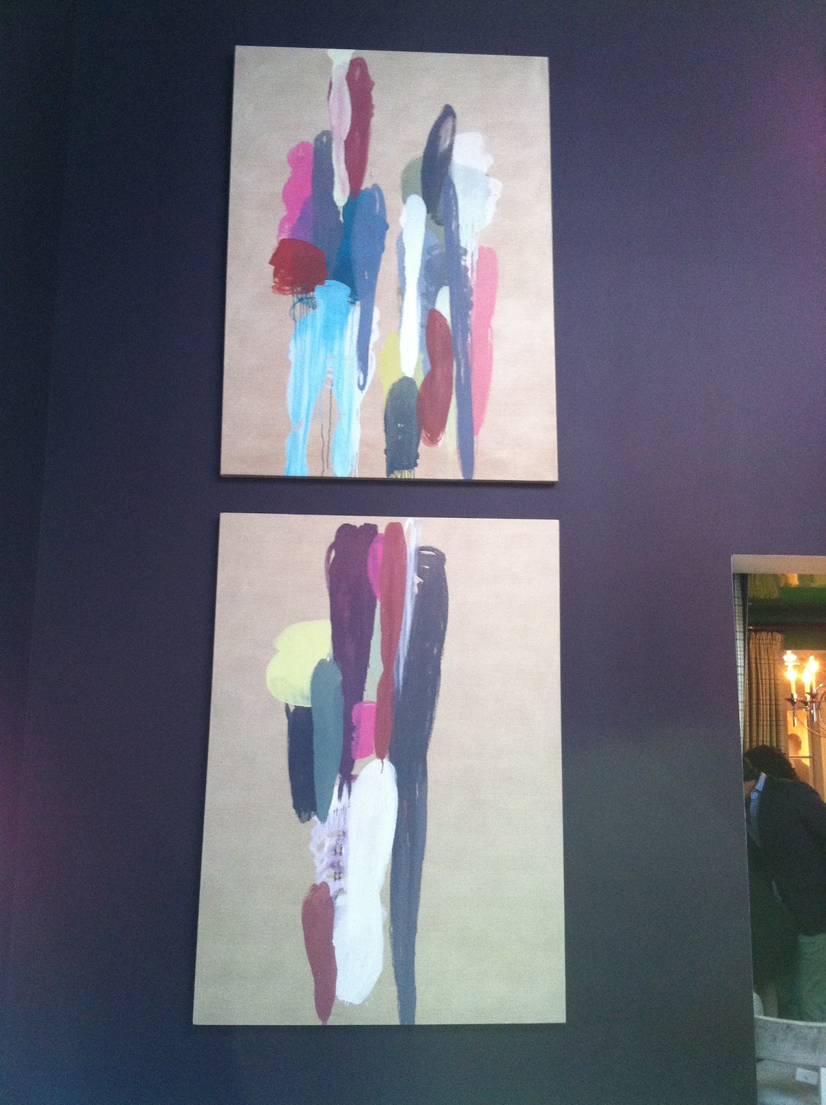
Chuck Fischer created the charming Chinoiserie sketch in the top photo for the decorative painting he would use his his room. Chuck is not only an interior designer, but a decorative painter and muralist as well. The lightness of his hand is evident is the execution of the painting.
All photos by Bespoke Banter unless otherwise noted.